About Me

Friday, January 12, 2024

Winnipeg Jets Jersey Concept

     Welcome back, folks. You might notice that I've updated the colour scheme of my blog site has gone from dark blue & white to double blue & white. That's because it's part of an update to my lockup which I explained in my previous post (alongside my first-ever post in this blog). So, enjoy this nice double blue colour scheme which I personally loved. And speaking of double blue, we're staying in Canada as we head west to Winnipeg, home of the Jets!

    The original Jets were your typical blue-white-red team before their relocation to Arizona. The revived Jets, however, take a different approach and become a double-blue team (alongside their RCAF-inspired identity). Their current set is quite a classic despite being introduced 13 years ago, but I can make it better.


    My concept above is pretty much modern to the max. I take advantage of the full-length yoke from the away jersey and make it a prominent feature in the set, and within the yoke is the double stripe motif from their home jersey now shaped to look like a W (for Winnipeg, or Win if you want). Speaking of the home jersey, my version of it is light blue with a grey yoke bordered by navy blue and white. Meanwhile, the away jersey is white with a light blue yoke bordered by grey and navy blue, with the W-stripes being white and navy blue. The socks are kept simple, though, as it would be messy to copy striping over. Pairing the whole set is the navy blue pants and light blue helmet and gloves. In conclusion, their current set is modern even by current standards, but I take it further into the skies and created a fresh new look for the Jets!

    That's it from now! C&C is appreciated! See you in the next post! Cheerio!


Wednesday, January 10, 2024

Small Update

 So when I posted my picture above to Chris Creamer's Sports Logo Community (CCSLC) Forum, a kind user named VampyrRabbit suggested me to *quote-unquote* thicken the letters of the lockup slightly, add a third colour, then add outlines to the lockup while keeping the separation, so its CP CP *end quote*. From what I can tell, he means that my logo is a bit too close and the spacing is too little. So I made a few adjustments to the logo, and now it looks like this.


    What I did is modify the dark blue by lightening up a little and tossing in a light blue, so now it becomes a double blue colour scheme. The wordmark is now bigger and the border is installed into the lockup. I'm happy with the result it comes out. Thanks again to VampyrRabbit for helping me improve as a concept artist.

    And just a bit of fun, here are a few more different colour schemes, all as wonderful and beautiful as each other.


    From now on, all of the changes in the lockup are now applied to the whole website. Thanks for reading the update and as always, C&C is appreciated.

Sunday, January 7, 2024

Ottawa Senators Jersey Concept Set

     Welcome back, fellas! Today, we're crossing borders up north, as I'll show you my concept for the Ottawa Senators.

    Ever since 1992, the Sens have a spotty track record of having a good-looking jersey set. Their most recent redesign involves them going back to their inaugural jerseys, albeit with some slight modifications.

2021-Present set
Courtesy of nhluniforms.com

1993-95 set
Courtesy of nhluniforms.com


    In between those two jerseys, Ottawa fans have seen their players wearing jerseys that ranged from disappointment to disgust. For example, when Reebok took over as a supplier for all NHL teams, the Sens opted to wear a templated version that is far more appropriate for training than wearing them in-game. And when the mantle passed on to Adidas, they threw the opportunity to redesign their jersey and stuck to their training sweaters. As for the alternates, let's just say they are of the mixed-bag variety.

    But enough talk. Here's what I came up with!


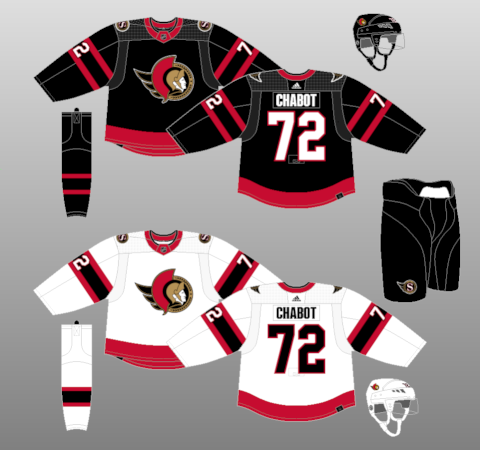
    As you can see here, my main inspiration for this set is their inaugural jerseys. But there is a twist in the form of their striping. I've gone for a subtle callback to their original Senators incarnation when they used to wear barber-pole stripes (a motif they used both for their 2014 Heritage Classic design, their 2017 Cennetenial Classic design, and the 2011 alternate which I showed to you via link). Essentially, I take their aforementioned inaugural set and throw a bit of white in it. I also added a stripe onto the yoke and applied the same thing to their collar treatment. Speaking of collars, I added laces so I could make my concept a little more traditional in an otherwise fairly modern set, while the font I've used is from their first alternate (which I also linked in this post) so now it looks more modern without straying too far away towards traditional. Completing this set is their alternate logo being promoted to primary status with the shoulder patch coming from -where else- their inaugural jerseys. Yeah, I think I like the Sens when turn back the clock to Year 1 three years ago.

    The away version is the same thing, where black and white swapped places with each other. The only difference is that I made the sleeve cuffs and bottom hem black so it wouldn't look too white. Tying together with the set are the fully black equipment including the helmet, glove, and pants. If it ain't broke, why fix it?


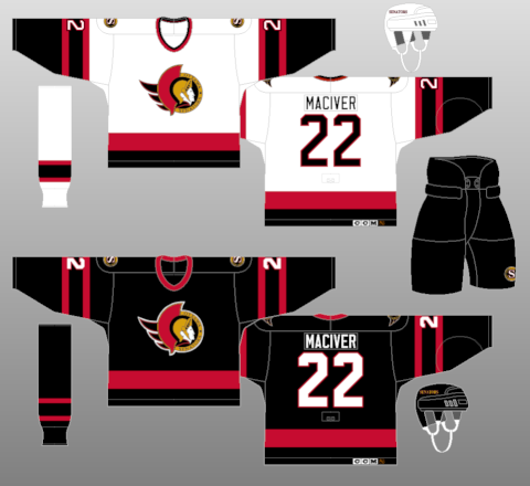
    I also made two other alternates of the jersey. The red jersey is pretty much the same thing as the main two, only that it has a black yoke to balance out the colour scheme. I fear there may not be enough black to distinguish it from other red jerseys in the league. The gold jersey, however, is where I take a little detour in terms of design. In the planning phase, I experimented with gold because their alternate from 2001 has gold in it as well. This made me wonder what would a gold Senators jersey look like, so I've come up with this. First, the two barberpole-esque striping is now converted into a standard Northwestern stripe with the colour of black-white-red-white-black. Then, the yoke stripe is now turned into a red square yoke bordering with white and black. Finally, I made the Peace Tower logo their primary and went with the traditional block font. You notice that the helmet and gloves are of a different colour than the others. That's intentional on my part to increase the colour balance, as I figured that I throw off said balance if I kept the black helmet and gloves.

    Well, that's it for me then. As always, C&C is appreciated. See you in the next post.

Saturday, January 6, 2024

New York Rangers Jersey Concept Set

     Hey, everybody! Welcome to my first jersey concept posted on this new website. And what better way to kick off the new post than to go with the team I decide to stay with after jumping from one team to another. Please welcome the Broadway Blueshirts: the New York Rangers.

    Now we all know that the Rangers jersey set is untouchable. The iconic wordmark placed diagonally on their blue sweater has always been a mainstay of their history (if you ignore what someone did to them in the mid-70s, that is). But while I was trying to come up with a Rangers jersey, I remember once seeing a concept where their wordmark is placed on its sleeves instead of the usual chest area. That's the moment the light bulb on my head lit up and so I got to work crafting one. The results are in the picture below.


    What you're looking at is a sorta combination of what I briefly described earlier and the John Ferguson-era mid-70s failed rebrand (which is what the link above is showing). Rather than going with the typical 'RANGERS' wordmark, I decided to go with their team's initials and apply it on the sleeves. Speaking of which, the stripe on the full-length yoke is taken from the striping of their iconic home jersey, resulting in a Rangers jersey that's more suited to the Stadium Series match than the regular season. Other than that, the rest is all just your standard Rangers affair. The font number and text are still here, as are the helmet, glove, and socks. The pants, however, are a slight modification of their actual ones to better fit my concept.

    The away jersey is the same affair, only this time with their actual away jersey. This, in turn, made the full-length yoke much more noticable than the home jersey, where it's a bit more subtle in comparison.


    To top it off this page, I also made a Lady Liberty-inspired version of it, complete with the Lady Liberty Logo itself, and plenty of silver just like their well-known alternate. Both jerseys now have full-length yokes that are coloured to bring in some contrast: red from home and navy blue for away. Consider this a new, unorthodox look for an Original 6 team.

    What did you think of my concept? Let me know by dropping your comments down below. Have a great day, everyone!


Friday, January 5, 2024

Welcome Aboard!

    Hey, everybody. Welcome to the new blog spot dedicated to all my creations related to sports, be it ice hockey, football, or any other sports. Welcome to my world built for interests, hobbies, and whatever I love. Welcome to Charles Pius's Creation Palace!


    First, a little introduction. My name is Charles Pius, and I'm from Malaysia (specifically from the state of Sabah). You may know me under my username, FC Macbeth. However, I plan to put the name into a semi-retirement as I create a new one instead for the purposes of concept designing. That means I'd still use the FC Macbeth name for my social media accounts, just that I think it'll be better (and more "proper") to use my real name rather than reusing the one I used for as long as I created a YouTube account.

    The main purpose of this blog site is to simply post concept designs for sports teams around the world. As of now, at least, all that stuff is going to be mainly focused on ice hockey jerseys since this is the first exposure to the world of concept designing. And I've been doing it for the past 7 years.

    Well, I hope you enjoyed an intro to my new website. For those of you reading this, look forward to a new jersey concept in around a day or two! See you there!

UPDATE:

    So when I posted my picture above to Chris Creamer's Sports Logo Community (CCSLC) Forum, a kind user named VampyrRabbit suggested me to *quote-unquote* thicken the letters of the lockup slightly, add a third colour, then add outlines to the lockup while keeping the separation, so its CP CP *end quote*. From what I can tell, he means that my logo is a bit too close and the spacing is too little. So I made a few adjustments to the logo, and now it looks like this.


    What I did is modify the dark blue by lightening up a little and tossing in a light blue, so now it becomes a double blue colour scheme. The wordmark is now bigger and the border is installed into the lockup. I'm happy with the result it comes out. Thanks again to VampyrRabbit for helping me improve as a concept artist.

    And just a bit of fun, here are a few more different colour schemes, all as wonderful and beautiful as each other.


    From now on, all of the changes in the lockup are now applied to the whole website. Thanks for reading the update and as always, C&C is appreciated.

Winnipeg Jets Jersey Concept

      Welcome back, folks. You might notice that I've updated the colour scheme of my blog site has gone from dark blue & white to d...